For this project, I gave myself the scenario of a client involved with digital security needing animated icons to provide feedback for biometric data. Four specific needs were identified: DNA, Retinal Scan, Fingerprints, and Facial ID.
The goal was to create designs that would be distinct and allow for unique animations while maintaining cohesion. The designs were created to invoke a tech aesthetic, while also being fun and inviting for users to interact with.
The style that I landed on was primarily constructed of rounded and softened edges. The colors begin with a soft blue gradient, chosen to invoke a sense of calm. Variations of purple and teal add a fun contrast to the design. Strong greens and reds were chosen to signify an accepted/rejected biometric reading.
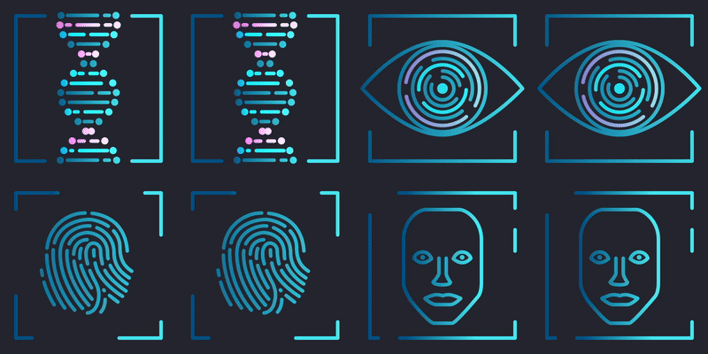
DNA
I animated the DNA differently than a double-helix would actually rotate. Rather than have the double-helix structure spiral down - imitating a true 3D appearance - I instead chose to maintain the shape to help the silhouette read clearly.
Retina
The circular design of the eyes led to the obvious choice of utilizing rotations. However, the pacing was monotonous, even when varying speeds and directions of the line rotations. As such I added the blink with a subtle squash-stretch to give a little character to the animation. The eyelashes - which appear only briefly - add flare and pop to the final result.
Fingerprint
I did not want to create a draw-on effect for the fingerprints, instead choosing to go with a cascading effect of shifting lines. I utilized different colors to build anticipation for the eventual positive/negative result.
Facial ID
The facial animation was the most ambitious of the four icons. It is also the one that deviated the most from the style.
I based the facial geometry upon accepted industry-standard facial geometry recognition, and then rigged it to a rounded face so that I could achieve a pseudo-3D effect with the character looking to the left and right.
In contrast to the other icons, it is the only design that is different (aside from color) if the result is positive/negative - smile/frown.
In Conclusion:
I enjoyed this project and was quite pleased with the results I found. I was particularly pleased with how the facial animation turned out and may look into other experiments with this style of animating in the future. Despite the four animations appearing very similar, each icon presented its own unique challenge in design and animation that made the project well worth the study.