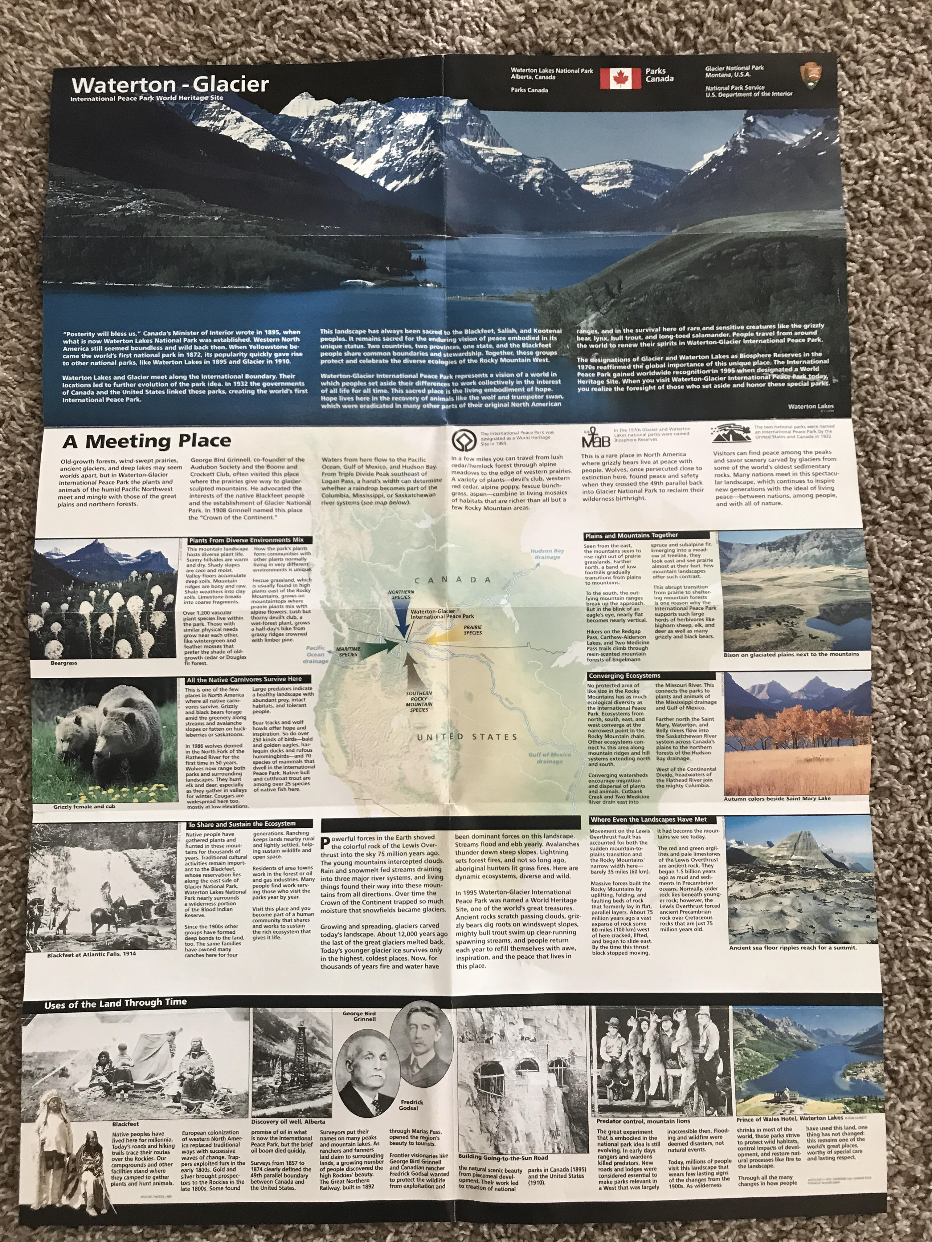
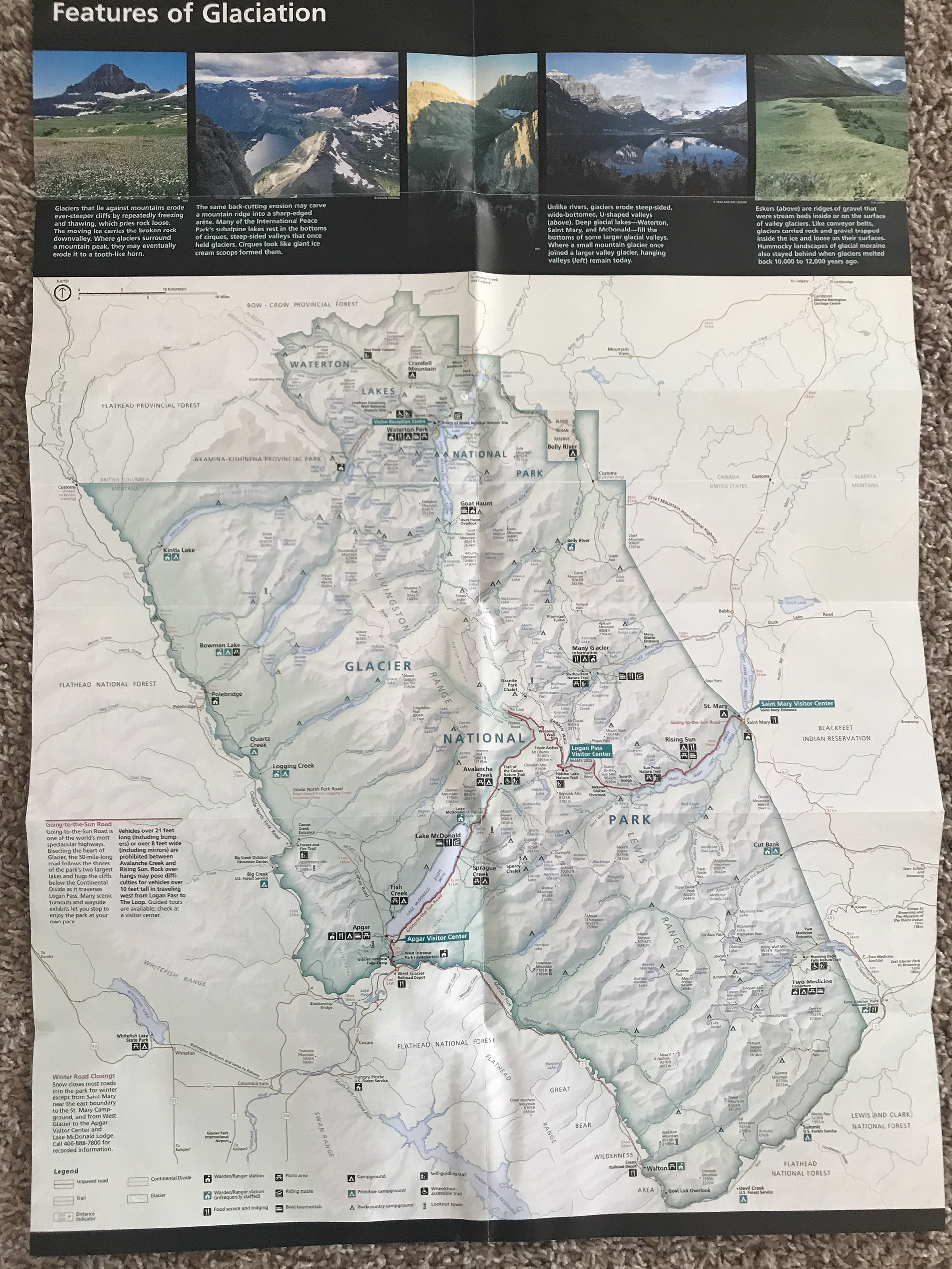
This was a self-guided project I took up after visiting Glacier National Park. Most national parks have some form of an informational brochure for visitors which contains a fair amount of useful information and maps. These brochures are also usually very large and cumbersome paper foldouts - not ideal for on the trail or in the car.
As such, I decided to create a new vision for these brochures that would be more user-friendly. A small hand-held device would be immensely easier to use to view park information.
I made a point to hold as true to the design style that was presented in the paper brochure, so that a user would have a seamless experience, regardless of the method they ultimately would choose to view the content. All copy in my mockups are ultimately pulled from the brochure.

Front of Brochure

Back of Brochure
A simple menu was created to help with the basic navigation. Each icon would lead to a specific section of the site/app.
The opening screen provides space for timely information to be provided (weather, holiday, special events, etc.)
The user flow was designed to be a sequential flow of one large page. I did not want to confuse users with multiple pages - it should be simple for a user to open and then read.
Arrows appear on each side of the screen to indicate whether the user can continue in that direction.
The flow ends upon a map - which in final production would be interactive with device GPS input.
There are three distinct regions where side-scrolling is used for pictures and information. The first two scrolling sections use a similar arrow indicator. The final scrolling group uses a more picturesque method.
This project was primarily an exercise in fitting an existing product into a modern setting. You can test the mockup yourself at the following link: https://xd.adobe.com/view/ae2993e4-e073-4fd0-a603-cdfaa4676a70-fb7a/
Instructions: Use arrows to navigate (this is to facilitate parallax effects) and the 'S' key to open the menu on the home screen. The menu is not currently functional.