As the motion designer for the Marketing team at Popmenu, I was a member of a team tasked with the development of a new visual brand for the company. I participated in the ideation and development of the overall visual designs; and took direct control of the development and execution of all motion graphics, animation, and video design. The rebranding began in late Q4 of 2022 and was publicly unveiled at the beginning of Q2 in 2023.
Delineation of Brand Pillars
A major facet of the rebrand was to clearly describe what Popmenu does. As a restaurant technology company, the exact answer to that can seem vague and all over the place. An overarching theme of 'Growth & Easy' was developed with three core pillars to support that theme: 'Capture', 'Connect', and 'Consolidate'.
With this foundation established, it was then decided to use color coding to group all graphic assets within the theme and pillars. Distinct iconography, proprietary stock photography and videography, and intentional use of motion would be used in junction with color to set Popmenu as a standout player in the restaurant tech field. Storytelling would cement that message.

Easy Growth
No matter which pillar is being discussed, growth and being easy underlines the message. This was implemented through the use of distinct graphics and rules for motion design.
One of the principles I enacted was constant growth, achieved through continuous scaling up and zoom-ins. The movement is usually subtle and may be contained within a static frame. Elements will generally enter from the bottom and/or left and exit to the top/right. Scaling or movement down is limited and generally reserved for depicting competitors or negatives that Popmenu does away with.
Generally, curves are heavily utilized in motion design, but a conscious decision to use linear movements was made. This is to emphasize the to-the-point and 'easy' nature of Popmenu.
Capture
Capturing data, whether it be about the restaurant or its customers is one of the most critical aspects of Popmenu's technology. As such, a more aggressive color was chosen to represent this pillar.
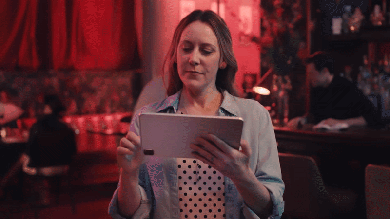
A heavy focus is placed on both the human element and data. In this example piece, a full story is being told – a restaurant owner is turning on technology, while also accepting a waitlist, which in turn is 'capturing' data.

Connect
Connecting a restaurant to its community and customers can be the make or break of its success. As such, a more nurturing tone was taken with this pillar. Showcasing the human element, both employee and patron, is the primary focus of this pillar.
This example piece helps tie together the message on the left with the b-roll story on the right through the use of color gradients. The word 'community' has the same color treatment as the frame around the video, this in turn allows for the viewer to connect the story they are watching with the idea of 'community'. Namely, a worker is caringly preparing an item, which then leads to a happy customer.
The piece also demonstrates the growth principle well, as the frame grows from the bottom left to the top right. At the same time, the b-roll contained within the frame slowly scales up.
Consolidate
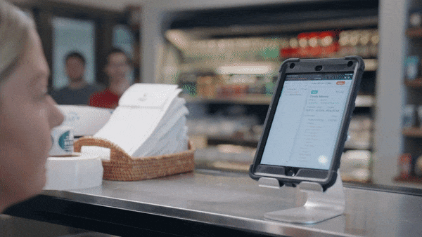
Consolidating the many moving parts of a restaurant is on the wishlist of every owner. While the previous pillars focus on the human element of the brand, this one focuses on technology and food.
The colors here are soothing but also invoke the idea of tech. In this piece, the framing brings focus to the tablet. The b-roll with a subtle push-in, the framing angled up and to the right, and the arrow motif all work together to instill the idea of growth, while focusing on the tech.
This piece also showcases the graphic motif of the arrow. In this piece, it is hollow, as we are focusing on only part of the overall brand. However, when discussing the brand as a whole, the arrow is filled in with all brand color.
Product Demonstrations
A heavy focus on showcasing the technology is present on the Popmenu website. However, I did not want to showcase other technology. Aside from distracting from our product, it could possibly endorse products that potential or existing clients did not approve of. As well, keeping up with the ever-changing landscape of computers, mobile, and tablet devices could present an undue burden on designers to keep things up to date.
The solution to this was implied screens. These shapes would read as any tech device that was needed without aligning with any specific real-world product. They also would have the ability to change shape when called for and give more artistic leeway.
Stock Videography
One of the key tenets to Popmenu is being relatable to restaurant owners - who probably aren't tech savvy. It was felt to be important that the brand represent itself as being human and real. A distinct choice is made to not use stock video of actors, but to rather utilize our own clients in their everyday environments. This inclination to lean away from pristine environments lends itself to authenticity.